
A visual accessibility review for a fitness app to ensure compliance with upcoming EU regulations. The project focused on enhancing color contrast and readability while preserving the app’s soft visual identity.
Client: Fitness influencer
Project Type: Accessibility audit
My Role: UX Designer
Overview
The Pam app was developed for a famous German fitness influencer Pamela Reif. It was originally designed several years ago and featured a bright pastel visual style. While visually appealing and on-brand, it did not meet the new accessibility standards required by the upcoming European Accessibility Act (EAA).
The client approached us to ensure the app could be made compliant without losing its aesthetic character.
My Role
As a UX designer with focus on accessibility, I contributed to the project with:
— The accessibility audit focused on visual contrast and readability.
— Collaboration with the development team to implement smart adjustments.
— Guidance to ensure future design decisions stay compliant.
— Collaboration with the development team to implement smart adjustments.
— Guidance to ensure future design decisions stay compliant.

Before accessibility audit
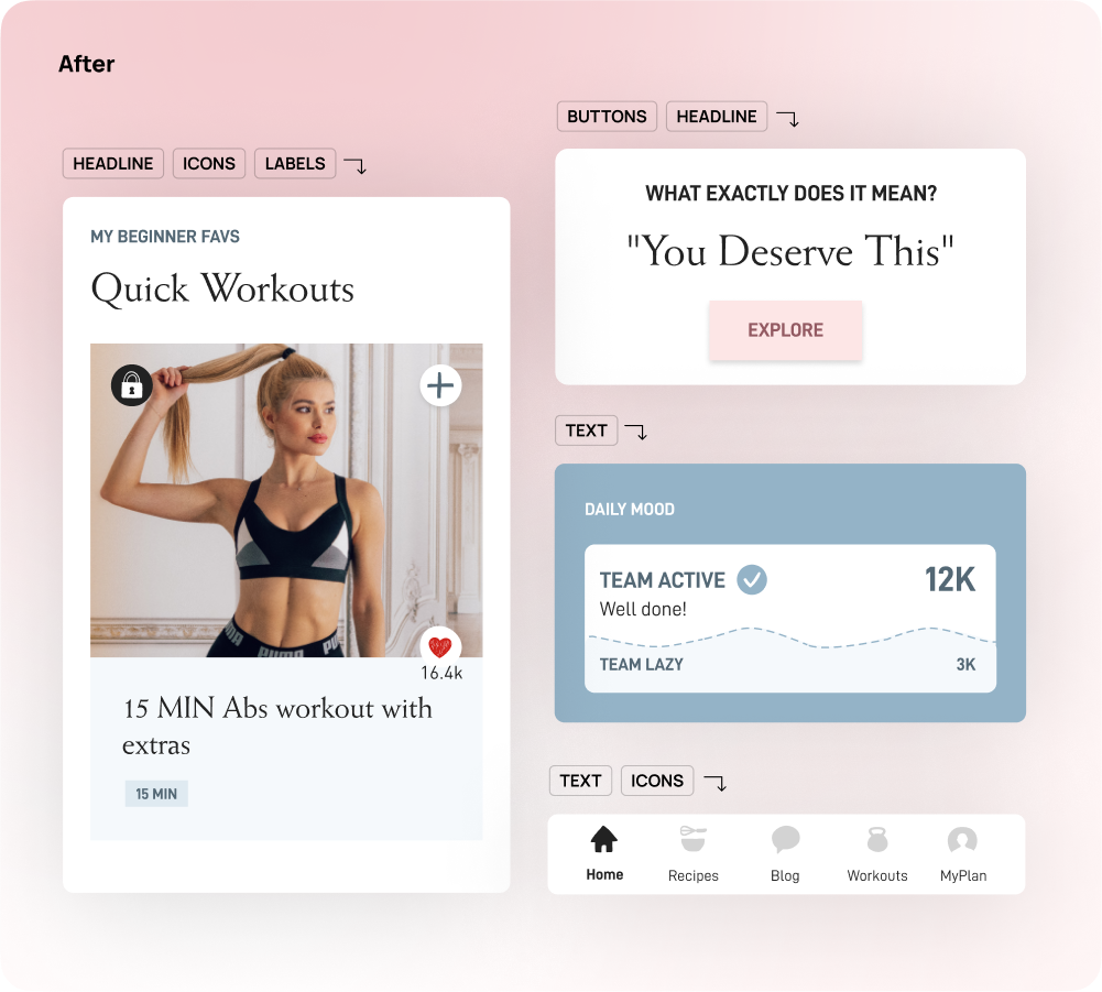
After accessibility audit
Process
🔍 Audit & Analysis
— The app was evaluated using WCAG 2.1 standards, focusing on colour contrast across key UI elements (text, buttons, tags, etc.).
— Documented areas where the app didn’t meet the minimum contrast ratios.
— Documented areas where the app didn’t meet the minimum contrast ratios.
🎨 Challenge: Maintaining Style
— The app’s visual identity relied on soft pastels and subtle tones.
— Directly replacing colours with high-contrast alternatives would disrupt the app look & feel.
— Directly replacing colours with high-contrast alternatives would disrupt the app look & feel.
💡 Smart Adjustments
Instead of applying changes across the board, it had to be carefully prioritized what truly needed to be updated.
For instance, by ensuring that the bottom navigation met accessibility contrast standards, we were able to preserve the original headline styles without compromising overall compliance. This allowed for a minimal yet effective set of visual tweaks that kept the design intact while improving usability for all users.
🛠️ Collaboration & Handoff
— Worked closely with the dev team to define how and where to apply updates.
— Delivered annotated mockups and an updated style guide with WCAG-compliant examples.
— Delivered annotated mockups and an updated style guide with WCAG-compliant examples.
Outcome
The review led to a set of targeted design updates that improved accessibility without compromising the app’s visual identity. By finding a balance between compliance and style, the app now better supports users with visual impairments while maintaining its original aesthetic.
The updated designs were well-received by both the team and stakeholders.